Categories
Uncategorized

Making Every Day Count: Why Occupancy Patterns Matter in ML Models for Energy Optimization

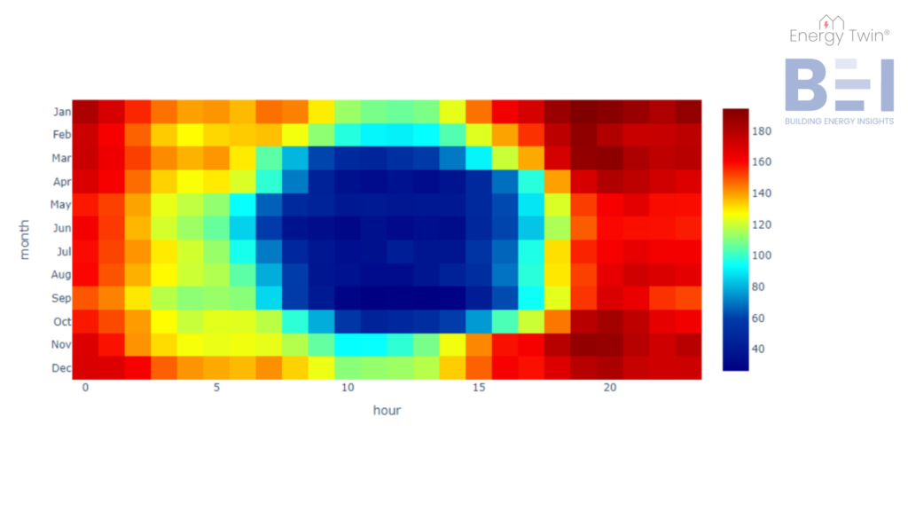
In the realm of energy data evaluation, machine learning models have unlocked significant potential. These tools support everything from energy conservation analysis to anomaly detection and optimization. But at the heart of any successful application lies one essential ingredient: a model that accurately reflects how buildings operate in the real world.


One often-overlooked challenge in achieving this reliability lies in managing the different operating regimes of a building. While weekly or monthly data evaluations may overlook these nuances, interval data analysis (e.g., hourly or 15-minute intervals) demands a deeper understanding of how building operation changes over time. In this newsletter, we explore how to address this challenge by distinguishing between occupied and unoccupied days and properly accounting for holidays.

Start with the Basics:  Occupied vs. Unoccupied Days

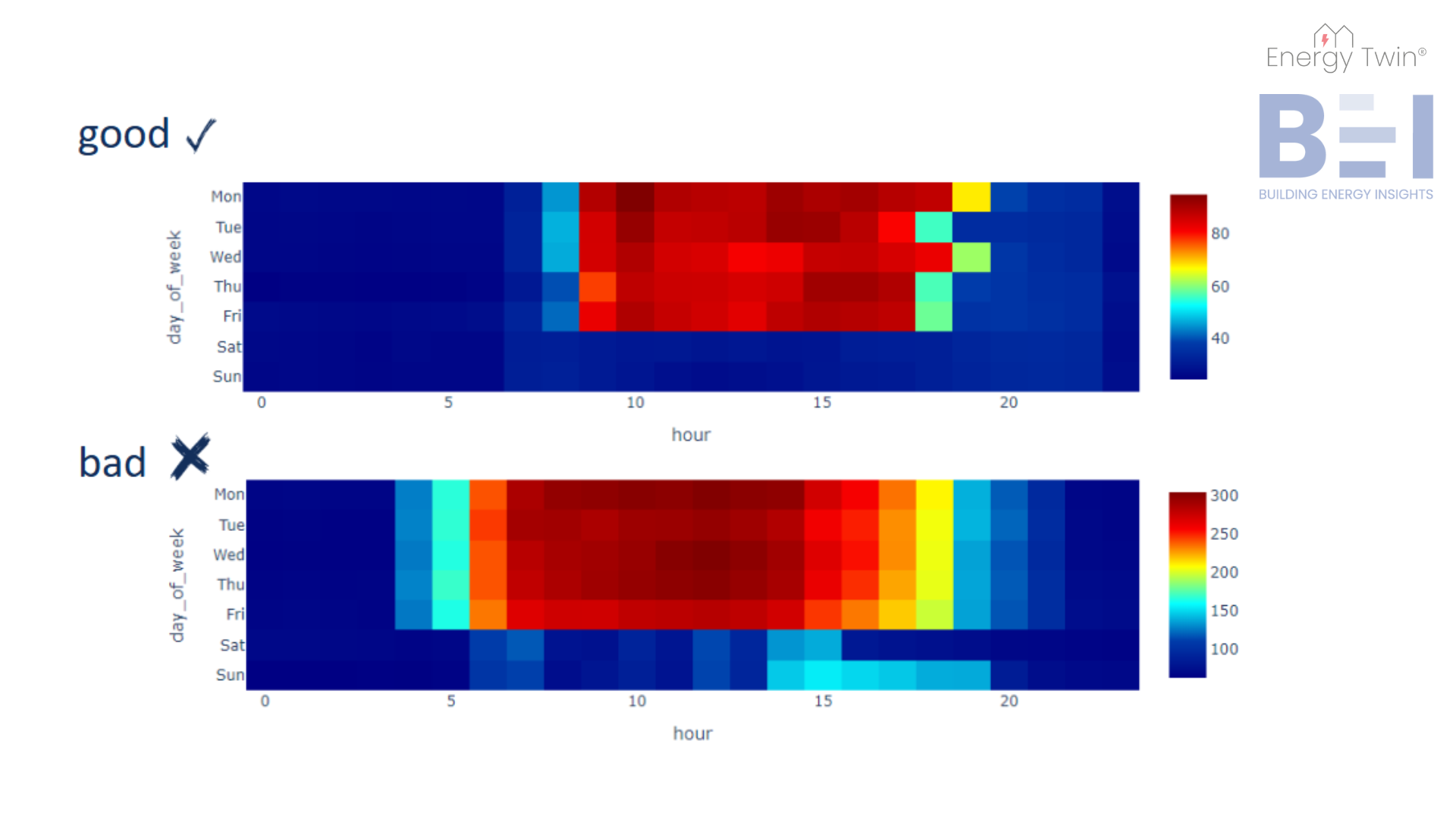
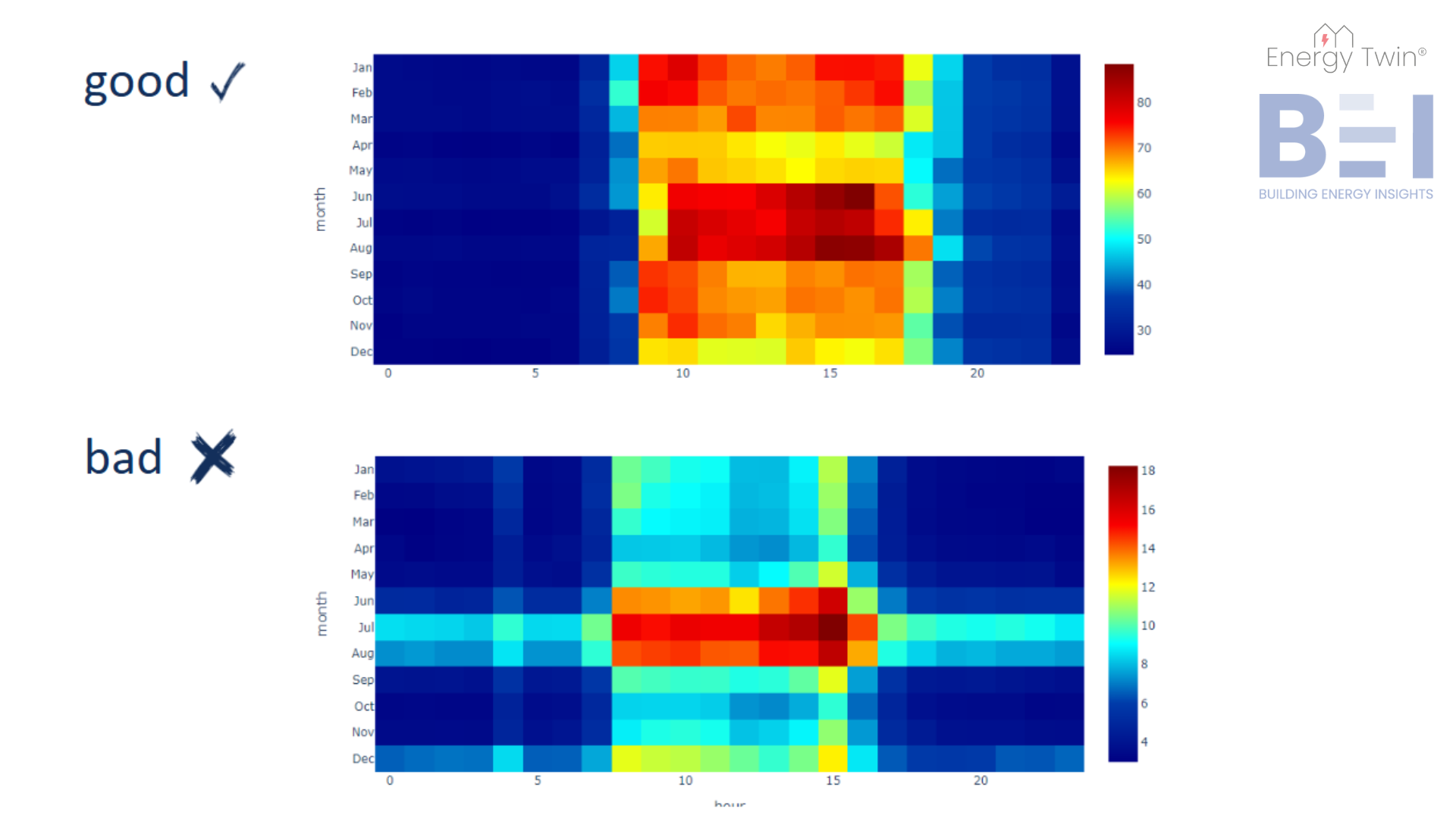
Commercial buildings frequently exhibit markedly different energy consumption patterns during workdays versus weekends. For simplicity, let’s assume the building is unoccupied during weekends, with a typical energy setback in place. This means reduced base consumption and adjusted weather-related loads reflecting heating or cooling setbacks.

Level Up Your Model: Don’t Ignore Holidays

Holidays pose unique challenges. They may seem insignificant due to their low frequency, but failing to address them can undermine model accuracy. For instance, if a model assumes a holiday is a regular weekday, the unusually low consumption may be misclassified—skewing predictions or masking anomalies.


That’s why we treat holidays as their own category, distinct from both weekdays and weekends. By recognizing their unique behavior, we turn potential outliers into expected patterns – improving model stability and predictive power.

A Real-World Example

Imagine we’re identifying a model using only three months of data – specifically Q2 2023. In the Czech Republic, this period includes four public holidays, three of which fall on a Monday. How does that influence the outcome?


In the chart below, you can see a comparison of two models on a regular week in February, when no public holidays occurred:

  • The blue line represents a model identified on Q2 2023 data with public holidays correctly taken into account.
  • The green line shows a model identified on the same data without accounting for holidays.
  • The red line shows actual measured consumption.

Notice how the green line significantly underestimates Monday consumption. By treating holidays as regular weekdays, the model learned an unrealistically low baseline – introducing a bias of more than 25 kW from just a few misclassified days. Why does this happen? In this case, 3 out of the 13 Mondays in the training data were public holidays. Without that context, the model tried to minimize error across all Mondays, combining regular and atypical days into a single profile. This pulled the expected load for Mondays lower, resulting in a distorted time-dependent pattern that doesn’t reflect actual operations. 


How do we handle holidays correctly to avoid this kind of mistake? It comes down to two things: identifying them accurately and modeling them appropriately.

Step One: Defining Holidays Automatically

Manually managing holiday calendars can be tedious and error-prone; especially when working with buildings across multiple countries or regions. At Energy Twin, we avoid this complexity by using a location-aware API (namely this great service https://date.nager.at/ ) that automatically downloads public holidays based on each building’s location. 

Step Two: Modeling Holidays Properly

Once holidays are identified, how should they be treated in the model? Should they behave like Sundays? Or should each holiday have its own profile? Modeling every holiday separately and ensuring that statistical properties of training data are met is not realistic (you do not have enough data to model each holiday separately). At the same time, lumping them in with weekends oversimplifies their unique patterns.

One method to find the right balance, used in our approach as well, is to define an “eighth weekday” for TOWT modeling. This captures the distinct behavior of holidays without overfitting, helping your model remain both generalizable and precise.

Conclusion

When weekend or holiday behavior is oversimplified, it can distort the entire model, leading to misleading savings estimates or missed anomalies. By clearly separating weekdays, weekends, and holidays, and capturing their temperature-driven dynamics, models better reflect real-world building operations.


This is especially important when following M&V (Measurement & Verification) guidelines, which typically require an R² above 0.75 and a CV(RMSE) below 25%. A model that previously failed to meet these criteria can suddenly fall into compliance by explicitly handling these exceptions. This reduces error, improves accuracy, and builds trust in your analytics.


When every day matters, holidays included, it’s worth taking the extra step to model building behavior as it truly occurs. That’s the kind of detail that helps turn data into decisions – and it’s a key part of the approach we take at Energy Twin.

Categories
Uncategorized

Decoding Weather-Dependent Loads: Key Patterns and Practical Insights

In one of our previous posts, we have covered what weather-dependent load is and how it can provide valuable insights into building energy consumption. This week, we’re focusing on specific examples that showcase common weather dependent energy patterns we observe when analyzing buildings.


For all the examples, the x-axis represents outdoor air temperature in °C, and the y-axis shows the additional weather-related energy consumption in kW. The blue line indicates unoccupied regime consumption, while the red line represents occupied regime consumption.

Cooling dominated building
Figure 1 - An example of a cooling dominated building with implemented cooling setback.

In Figure 1, we see a typical cooling-dominated building with well-managed operations. Notice how energy consumption rises with increasing temperatures only during the occupied regime. During unoccupied periods, the energy consumption remains flat, indicating that the cooling setback is functioning effectively. This is the desired behavior.

Figure 2 - An example of a cooling dominated building with not sufficient cooling setback.

However, in Figure 2, we see a different scenario. While there is some distinction between the occupied and unoccupied regimes, the gap is not sufficient to indicate effective cooling setback. This suggests that cooling continues even when the building is unoccupied, revealing energy savings potential.

Heating dominated buildings

The same logic applies to heating-dominated buildings. Heating setbacks during unoccupied periods should be optimized to balance energy savings with thermal inertia. Overly aggressive reductions—such as complete weekend shutdowns—can delay Monday warm-up and strain HVAC systems during recovery. A practical target is an 80% heating setback. For example, if the heating-related load is 10kW, the unoccupied load should ideally be 8kW. Reducing the indoor temperature by just 1°C can lower the heating load by approximately 6%.

Figure 3 - An example of a heating dominated building with implemented heating setback.

Figure 3 demonstrates a heating-dominated building with a well-implemented setback. In contrast, Figure 4 shows a building where heating setback is either nonexistent or poorly implemented, as indicated by the overlapping consumption patterns.

Figure 4 - An example of a heating dominated building with no implemented heating setback.
Buildings with Both Heating and Cooling Loads

Of course, a building doesn’t have to be just cooling or heating dominated. Many energy patterns resemble a “U” shape, where we have some heating-related energy consumption in colder months, minimal load during shoulder periods, and cooling-related consumption in warmer months. How should we interpret such patterns, and what should we focus on? Let’s look at a few examples.

Figure 5 - An example of a weather dependent load of a building with both heating and cooling loads with no implemented setback.

In Figure 5, we see a building with both heating and cooling loads, but with almost no distinction between the occupied and unoccupied regimes. The slight reduction in cooling load during unoccupied hours is not sufficient to indicate effective setback implementation. Uncovering immediate savings opportunities can be as easy as reviewing existing equipment schedules and setpoints with no need for costly investment.

Figure 6 - An example of a weather dependent load of a building with both heating and cooling loads with implemented cooling setback but no heating setback.

In Figure 6, we observe a more defined cooling setback. At 30°C, the unoccupied cooling load is approximately 4kW, while the occupied load is 10kW. However, the heating regime shows minimal differentiation, indicating a missed opportunity to adjust heating schedules and setpoints.


Finally, let’s look at a building that gets it right for both heating and cooling. In Figure 7, we see a clear reduction in the unoccupied regime for both heating and cooling loads. This is the desired behavior, demonstrating effective setbacks and indicating significant potential for savings through targeted schedule and setpoint adjustments.

Figure 7 - An example of a weather dependent load of a building with both heating and cooling loads with implemented both cooling and heating setbacks.
How can we apply these insights in practice?

Identifying inefficiencies in weather-dependent load patterns provides a clear path to actionable savings. By fine-tuning setpoints and schedules, we can reduce unnecessary consumption, estimate potential savings, and prioritize buildings within a portfolio for targeted adjustments.

Next week, we’ll shift our focus to time-related load patterns and how they shape building energy use. Stay tuned!

Categories
Uncategorized

Time-of-Week and Temperature model explained

Introduction – motivation

Imagine you’re trying to figure out how outside air temperature (OAT) and time-of-week affect energy consumption in a building. With a “common sense” approach, you’d need to test each factor separately—keeping all other variables constant while changing just one. But in the real world, things don’t work that neatly. Inputs like OAT and time-of-week change simultaneously, creating a noisy, messy dataset.


To illustrate this, we’ll use a real-world dataset showing main electricity consumption (kW) alongside OAT (°C). Even at a quick glance, it’s clear that energy use increases during the summer—most likely due to cooling loads. But let’s dig deeper.

Upper graph shows 1 year of energy consumption data in kW. Lower chart shows OAT in the same time span (x-axis).

In the traditional workflow, analysts often begin by plotting a scatter chart of OAT against energy consumption, using monthly or weekly averages using methods such as degree days or ASHRAE changepoint. However, evaluation of aggregated data does not provide any insight into intraday energy consumption profile. So you need to analyse hourly data. But when we move to hourly data, variability skyrockets, see chart below. For instance, at an OAT of 26 °C during a typical workday, observed consumption can swing anywhere from 60 kW to 130 kW. With such a wide range, pinpointing expected usage becomes nearly impossible without accounting for more than just temperature.

Energy use isn’t driven solely by temperature – it also follows a time-of-week schedule (office hours, weekends, nights). Hot afternoons often coincide with peak operating hours, making it difficult to untangle these overlapping influences. Simply comparing “temperature vs. load” merges two distinct patterns together.


This is where machine-learning models like TOWT come in. By simultaneously fitting both time-of-week and temperature effects, the model learns, for example, that a 30 °C Tuesday at 3 PM will draw more energy not only because it’s hot (cooling demand) but also because it’s mid-afternoon on a workday (higher occupancy).


A helpful analogy is listening to an orchestra. To the untrained ear, it’s a single wall of sound. But experienced listeners can pick out individual instruments, rhythms, and harmonies. TOWT does the same with energy data: it separates overlapping signals so we can understand them in isolation.


Technical detail part


The original concept was introduced by Price in “Methods for Analyzing Electric Load Shape and its Variability” (Lawrence Berkeley National Laboratory Report LBNL-3713E, May 2010) https://eta-publications.lbl.gov/sites/default/files/LBNL-3713E.pdf  Since then, it has been widely adopted—cited in numerous academic papers and implemented in open-source tools like RMV2.0 (LBNL), NMECR (kW Engineering), and OpenDSM (formerly OpenEEmeter). It’s also a core part of the CalTRACK Methods and features in several commercial tools, including our own at Energy Twin.

At Energy Twin, we’ve built on the original idea, developing several extensions to make the model more useful in real-world applications—especially where high granularity and robustness are essential.

Weather dependency

Let’s focus on one of those key influences: weather dependency.


Once the TOWT model has separated schedule and temperature effects, we can extract the pure weather-dependent load. This final step reveals how much additional energy consumption is driven specifically by outdoor temperature, plotted separately for occupied and unoccupied days.

Weather dependent load. OAT [°C] on the x-axis and added energy consumption due to the weather [kW] on the y-axis. Red line depicts occupied hours and blue line depicts unoccupied hours.

By breaking down these intertwined effects, we gain a much clearer understanding of how weather truly impacts energy consumption – a crucial insight when moving from simpler, monthly models to more granular hourly or daily analyses, just compare the graph above with the hourly scatter plot data.

Time-of-Week Dependency

When working with TOWT (Time-Of-Week and Temperature) models, it’s just as important to account for time dependent load – patterns driven not by weather, but by routine. These time-of-week (TOW) driven variations reflect predictable behaviors: office occupancy, operational schedules, or equipment cycles. They repeat week after week, regardless of outdoor conditions.


When modeling the time dependent load – each hour of the week (or 15-minute, 5-minute interval) is treated as a distinct category, allowing the model to capture patterns in energy consumption independently of weather influences. These are typically related to occupancy, schedules, or equipment cycles.


For those who want to dig a bit deeper into the technical side…


To represent these categorical time periods numerically, one-hot encoding (OHC) is used. Using this technique, we transform each time interval into a binary vector where only the element corresponding to the current time slot is set to 1 and all the others are 0. These vectors serve as independent variables in the resulting regression model, enabling it to learn separate baseline consumption levels for each time period. This article provides a clear illustration of how one-hot encoding works, along with simple examples.  https://www.geeksforgeeks.org/ml-one-hot-encoding/


Granularity – How precise should your time model be?


The TOWT model reflects multiple levels of temporal granularity, depending on the available data and the desired resolution of analysis. Time-of-week OHC can be constructed at different intervals—such as hourly, 15-minute, or even 5-minute.

Comparison of time dependent loads of hourly, 15-minute and 5-minute models. Y-axis shows time dependent load [kW]. The x-axis shows the hour of the day.

Choosing the appropriate resolution is a tradeoff between capturing time-sensitive variability and maintaining model stability. As you can see in graph above, moving from hourly to 15-minute granularity makes a significant difference, revealing much finer operational patterns – such as short-duration spikes or control system behavior. 


Variants of TOW Modeling


Each building may require a different definition of the TOW structure, depending on how complex its operational schedule is and how much historical data is available. For facilities with consistent, predictable usage, a simple approach – such as a single daily profile repeated across the week – might be sufficient. But this isn’t suitable for most commercial buildings, which tend to follow more varied routines. A more common  approach is the typical TOWT, which assigns a separate profile to each day of the week, allowing the model to reflect different usage on weekdays versus weekends. For even higher fidelity, the model can incorporate custom day types – such as holidays, maintenance periods, or seasonal shutdowns – by adding binary indicators or grouping time slots differently. 

Time dependent load of 15-minute model where each day of week is represented separately.
Conclusion

The Time-of-Week and Temperature (TOWT) model has become a widely recognized and trusted approach for detailed energy consumption modeling. One of its greatest strengths lies not just in its predictive accuracy, but in its transparency.


Unlike many black-box machine learning models—such as neural networks—that may yield high performance but little interpretability, TOWT offers clear, explainable parameters. These include distinct components for weather-dependent loads and time-of-week-dependent loads, which provide valuable insights into the underlying behavior of a building. In essence, you’re not just getting a forecast—you’re gaining a deeper understanding of how and why a building consumes energy the way it does.


This interpretability is critical in real-world energy analytics, where decision-makers need to justify savings, uncover inefficiencies, and tailor operational strategies based on specific drivers. For example, knowing how much of a building’s load is due to weather (e.g., cooling demand) versus operational schedules (e.g., peak working hours) enables targeted energy-saving measures.


Thanks to its balance between statistical rigor and practical insight, TOWT remains a cornerstone method for analysts, auditors, and engineers working on high-resolution, actionable energy models.

Categories
Uncategorized

Why Basic Anomaly Detection Fails in Energy Data (And How ML Fixes It) ⚡

Detecting anomalies in energy data is key to optimizing consumption, reducing costs, and ensuring building systems run efficiently. With the vast amount of data from smart meters, manual oversight isn’t practical—this is where machine learning (ML) steps in! 


The basic idea is simple: train an ML model to predict energy consumption based on historical data and use this model to compare predicted and measured values. Any significant deviation between the two can signal an anomaly. But how do we define and detect these deviations? There are several approaches, ranging from basic thresholding to advanced statistical and algorithmic methods, which we will explore in this article.

Basic Anomaly Detection Algorithms

Absolute Value Deviation – The simplest approach is setting a fixed absolute threshold. If the difference between measured and predicted energy consumption surpasses a set threshold, it is identified as an anomaly. While straightforward, this approach doesn’t scale well across different buildings, for instance, a threshold that works well for a large office building may lead to false positive or missed anomalies in a small retail store.

📊 Relative Value Deviation – A more adaptable method considers deviations as a percentage of the predicted value, e.g., more than 50% deviation triggers an alert. This works well across varying energy scales but can cause false positives for buildings with low consumption.

🔗 Combined Approach – The best of both worlds! By applying both absolute and relative thresholds, anomalies are flagged only when both criteria are met (e.g., >20% deviation and >5 kW). Adding a minimum duration filter helps avoid false alarms from short-lived fluctuations.

An example of relative value deviation rule with a 50% threshold.
Advanced Anomaly Detection Algorithms

The above-mentioned basic algorithms can be simple and effective, they may struggle with complex patterns and time-dependent variations in energy data. Let’s have a look at more advanced anomaly detection algorithms that enhance accuracy and reliability.


🔢 Statistical Tests – Statistical methods offer a more sophisticated approach. For example, energy consumption profiles for weekends can be compared to typical weekday profiles. If weekend energy usage closely resembles a workday pattern, it may indicate that HVAC systems are not being properly adjusted for setbacks.

📈 Integral-Based Comparison – This method integrates the differences between predicted and measured values over time. By accumulating small deviations, it detects anomalies when the cumulative difference crosses a predefined threshold. This approach is particularly effective for identifying subtle but persistent changes that might be missed by simpler methods.

Quantifying Temporal Dissimilarity – Advanced techniques like the CORT dissimilarity index go beyond magnitude comparisons, capturing temporal misalignments between predicted and measured values. For instance, if energy consumption lags or leads expected trends, CORT can highlight these discrepancies. Compared to basic thresholding, such methods provide deeper insights into the nature of anomalies, particularly in time-dependent patterns.

An example of daily integral rule.
Practical Considerations for Anomaly Detection

So far, we’ve covered both fundamental and advanced techniques for detecting anomalies in energy data. But theory alone isn’t enough—real-world implementation comes with its own set of challenges. In this article, we’ll focus on two key aspects: handling holidays and effectively representing anomalies.


🎄 Handling Holidays – Holidays present unique challenges for anomaly detection since they disrupt regular energy consumption patterns. Inaccurate modeling of holidays can lead to missed anomalies or false positives. At Energy Twin we address this issue by treating holidays as an “eighth day of the week” – separate from Saturdays or Sundays with distinct modeling properties. Holidays can be downloaded automatically based on location or manually defined, ensuring accurate anomaly detection even during non-standard periods. Automatically downloading holidays simplifies working with international portfolios, ensuring consistency across different regions.

📊Representing Anomalies – When managing large building portfolios, anomaly detection can generate hundreds of alerts. Without effective representation, prioritizing and acting on these anomalies becomes overwhelming. Energy Twin models integrate seamlessly with existing solutions such as SkySpark’s Swivel feature, providing intuitive, portfolio-wide overviews. Instead of sifting through endless alerts, building managers can pinpoint key anomalies in minutes, ensuring efficient monitoring and decision-making across their entire portfolio.

An example of detected Czech public holiday - 28th October.
Conclusion

Anomaly detection is a cornerstone of energy efficiency, enabling proactive management and substantial cost savings. Machine learning enhances this process, providing precise and reliable models that minimize false alarms—often the biggest challenge in deploying such systems.


At Energy Twin, finely tuned ML models and robust integrations with tools like SkySpark empower us to monitor hundreds of buildings in mere minutes. This ensures no significant issue in energy consumption goes undetected, delivering actionable insights that translate into real-world benefits. With ML-driven anomaly detection, energy efficiency is not just a goal but an achievable reality – turn anomaly detection into strategic advantage! 🚀

Categories
Uncategorized

From Heatmaps to AI 📊: The First Step in Understanding Your Data

Every journey into AI begins with a crucial first step: understanding your data. Many clients approach us eager to jump straight into machine learning (ML), but without a clear grasp of their data or meeting key prerequisites for ML, this leap often leads to frustration. Why? ML can only produce meaningful results when built on a solid foundation—with data preprocessing playing a vital role.


This is where data visualization comes in. Seeing your data clearly and gaining new perspectives and insights is the essential first step. Some methods, like heatmaps, go even further—empowering technical teams with detailed analysis while providing non-technical stakeholders with an intuitive, quick and easy-to-understand view of optimization opportunities.

Heatmaps

For those unfamiliar with heatmaps, they are visual representations of data where values are displayed as colors. This makes it easy to spot patterns, trends, and anomalies at a glance, providing an intuitive way to understand complex information. Let’s explore some examples!

In the following set of heatmaps, the x-axis represents the hour of the day, and the y-axis displays the days of the week. Each cell within the heatmap reflects the average energy consumption for a specific hour and day, providing a concise visual summary of the building’s energy use. This approach is comparable to a pivot table with conditional formatting, where data is organized systematically and shaded to highlight key patterns and anomalies.

The first heatmap showcases an office building with a well-configured weekend setback. The heatmap clearly shows low energy consumption during night hours and weekends, which are shaded in blue. This indicates that the building’s energy use is well-managed during non-operating hours, with peak energy usage occurring during standard working hours, from 9 a.m. to 5 p.m. on weekdays, with slight extensions to 6 p.m. on Mondays and Wednesdays.


In contrast, the second heatmap highlights an office building with operational inefficiencies. Starting with the weekend setback, we see that Saturday is well-managed, but Sunday shows an anomaly. From 2 p.m. to 7 p.m., energy consumption unexpectedly rises, disrupting the consistent blue pattern of low energy use throughout the day. Additionally, there’s a problem with the startup and shutdown periods. If the building operates from 7 a.m. to 5 p.m., why is it starting up as early as 4 or 5 a.m.? The night setback, which is set to begin at 8 p.m., is also somewhat late. It would be more efficient if the setback were activated earlier, around 6 or 7 p.m., to minimize unnecessary energy consumption.

Image 1: Daily heatmap examples.

To gain a deeper understanding of your building’s energy usage patterns, it’s crucial to look beyond daily patterns and consider how energy usage changes throughout the year. In this set of heatmaps, the y-axis represents the months of the year, giving us a clear view of how energy consumption fluctuates across the seasons. 


In the first heatmap, we observe consistent and effective night setbacks year-round. We also see that the building is cooling-dominated, as the highest energy consumption occurs during the summer months of June, July, and August. Some heating-related energy use is apparent in the mornings during January and February. These patterns are typical for an office building in Central Europe, where gas heating is common, and cooling accounts for the majority of electrical energy consumption in warmer months.


In contrast, the second heatmap illustrates inefficient cooling practices. During the summer months, particularly in July and August, night setbacks show higher energy consumption than expected, indicating inefficiency. Additionally, we notice regular energy usage at 4 a.m. in certain months, including June, July, August, and December, which suggests unnecessary operational activity during off-hours.

Image 2: Monthly heatmap examples.

A unique energy pattern is shown in the following heatmap from a building located in Central Europe. The lowest energy consumption occurs during the summer and daylight hours. What’s responsible for this change?


The building is equipped with photovoltaic (PV) panels. This example illustrates how renewable energy sources can significantly alter a building’s energy profile, and heatmaps provide an intuitive way to track and understand these shifts.

Image 3: Energy profile after adding PV panels.
Conclusion

Heatmaps are a powerful yet simple tool for understanding energy consumption patterns. Whether revealing operational inefficiencies in weekly heatmaps or uncovering seasonal trends in yearly heatmaps, they provide a clear, actionable view of a building’s energy usage. By starting with this foundational step, we ensure that the data is not only understood but also prepared for deeper analysis, such as machine learning. This approach enables smarter decision-making and paves the way for AI-driven insights that can optimize energy management across buildings and portfolios.

Categories
Demo Series

Demo Series Part 01 – Energy Twin Interactive

New video series is here! In this video we will show you the full demo of Energy Twin Interactive, our machine learning extension for SkySpark for daily, weekly and monthly data.

Categories
Analytics Walkthrough

ET Analytics Walkthrough 03 Utilizing a model for anomaly detection – Part 1

In this tutorial we will showcase how Energy Twin Analytics models can be used for anomaly detection using pre-defined rules, such as Relative Value Deviation rule.

Categories
Analytics Walkthrough

ET Analytics Walkthrough 02 Visualize a Model Using ET Views

This tutorial is focused on visualization of a model in the app ET Views once it has been identified.

Categories
Analytics Walkthrough

ET Analytics Walkthrough 01 Create a Model

This video demonstrates how to identify a model in the ET Admin app using Energy Twin Analytics.