AI for Main Electricity Meter Analysis: The Basics
Artificial Intelligence (AI) is revolutionizing energy analysis by turning granular smart meter data into actionable insights. It enables us to detect inefficiencies, forecast usage, and optimize building performance at scale.
This article focuses on analyzing main electricity meters in building portfolios—though the same principles apply to heat, submeters, and other systems. We also highlight the value of explainable AI models that provide both transparency and building-specific insights. Unlike black-box approaches, these tools help users understand and trust the logic behind optimizations.
At the heart of AI-based energy analysis is model identification using historical data. By analyzing a base period, the model learns the typical energy behavior of a building, which can then be used for a variety of applications:
- Anomaly Detection: Automatically flagging deviations from expected patterns, whether caused by equipment failures or incorrect schedules.
- Energy Conservation Measures (ECMs) Evaluation: Assessing the impact of implemented measures, such as lighting upgrades or HVAC adjustments.
- Predictions: Providing accurate energy forecasts for budgeting and operational planning.
- Demand Response Scenarios: Simulating and optimizing load reductions during peak demand periods.
- Benchmarking: Comparing performance across buildings or time periods to identify underperforming sites.
Various machine learning models can support these tasks, including neural networks, gradient boosting methods like XGBoost, support vector regression, and Time-of-Week and Temperature (TOWT) models. One example builds on TOWT and combines advanced optimization with explainability to deliver deeper, more actionable insights into consumption patterns. This sets the stage for powerful multisite portfolio analysis, with AI scaling insights across hundreds of buildings.
Analyzing Building Portfolios Using Only Main Meter Data
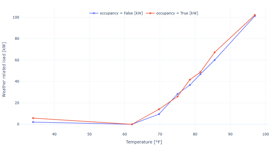
Once AI proves its value at a single site, it’s natural to scale up—because the true power of AI shines when applied across entire building portfolios. By separating weather-dependent and time-dependent loads, AI helps us better understand what drives energy use. And with hundreds of sites, tailored Key Performance Indicators (KPIs) become essential for making sense of the data.
Cooling Setback Insights
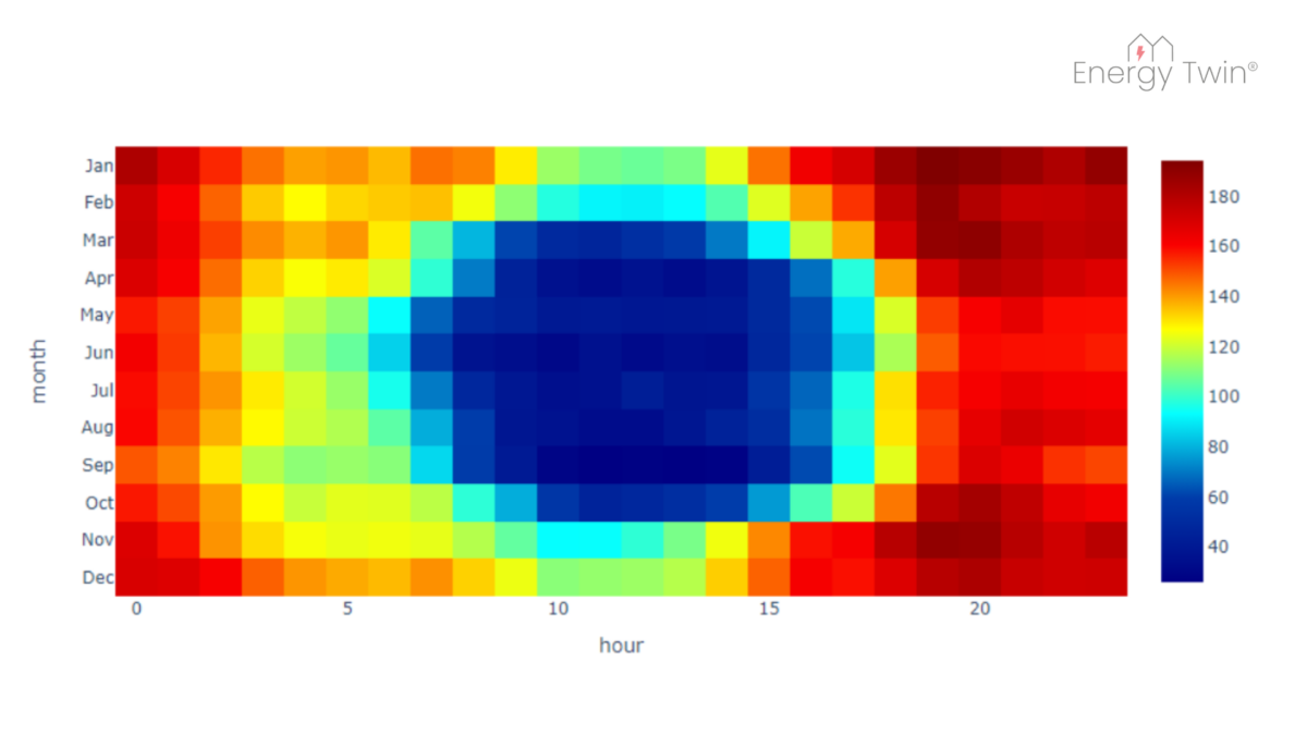
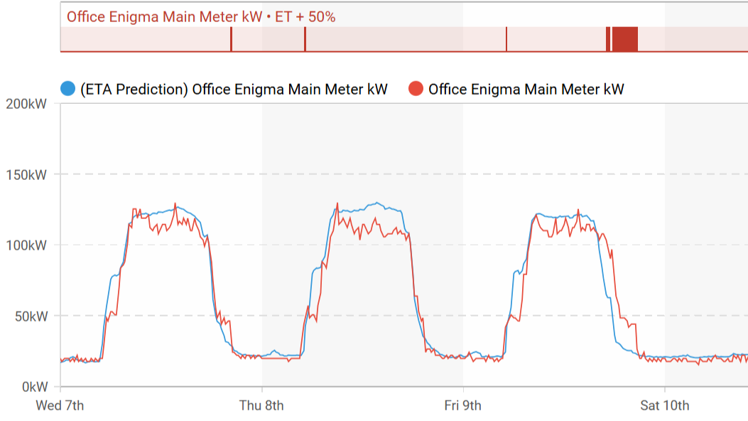
In well-managed office buildings, cooling loads should drop significantly when spaces are unoccupied—especially over weekends. Yet, patterns uncovered through AI often reveal something else. Even buildings that appear efficient on paper may show signs of systems running outside expected schedules.
What’s striking is that these insights come from something as simple as main electricity meter data—no extra sensors or submeters needed. It’s a reminder of how much valuable information is already available, waiting to be uncovered through the right lens.
Some common issues include:
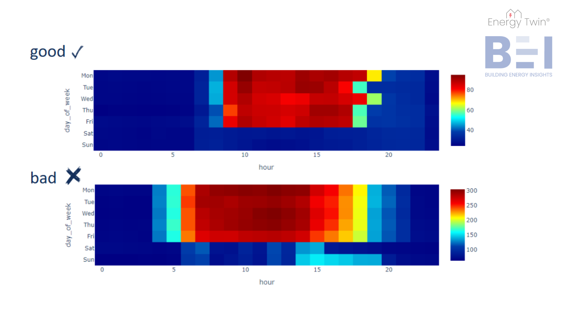
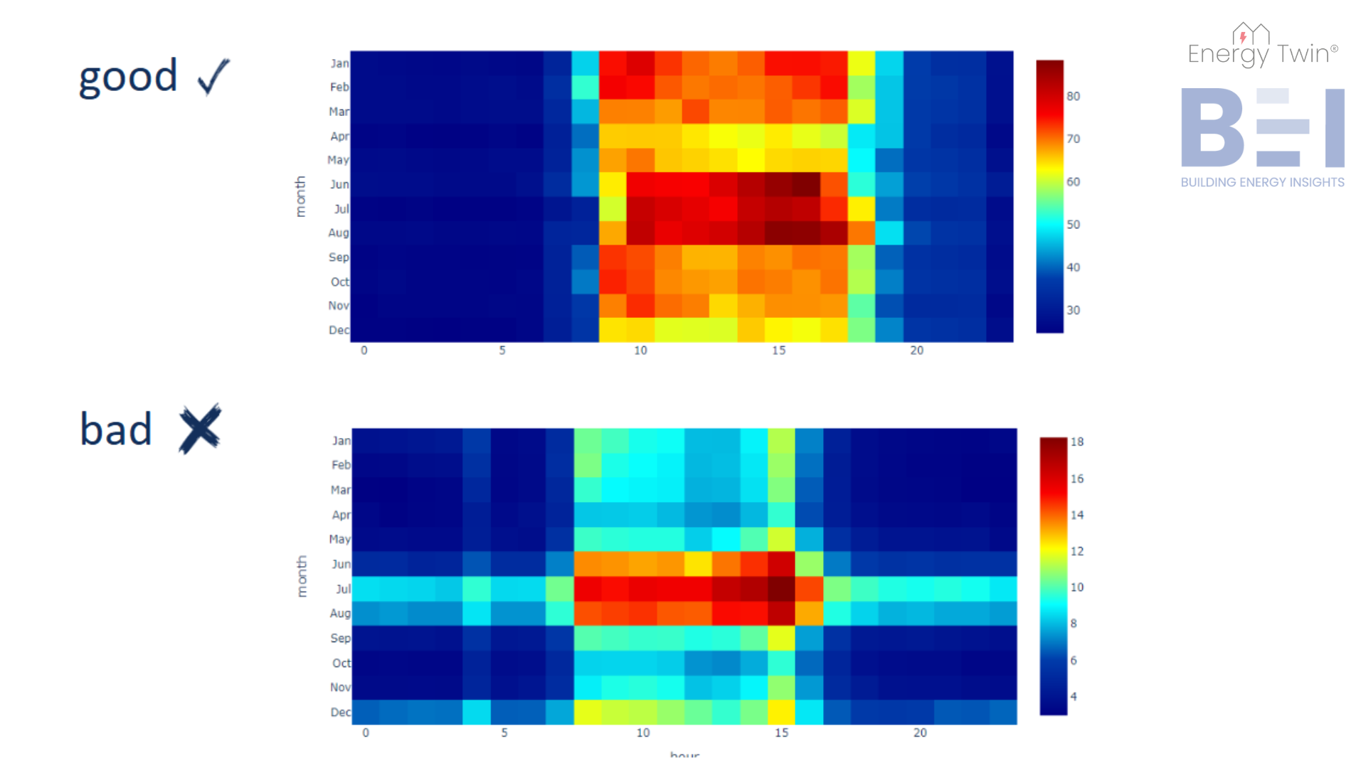
- Not Integrated Cooling
Cooling systems run independently of actual occupancy, responding only to outdoor temperature. The result: cooling continues over the weekend, even when no one is there. - Overcorrections
Setbacks may be in place but have been manually disabled—often due to Monday morning comfort complaints. For example, cooling a branch on Saturday has little impact on comfort by Monday, but disabling the entire weekend setback wastes energy. - Partial Occupancy, Full Cooling
Only part of the building is in use, but the entire system is cooling as if it were fully occupied.
AI changes the game. With only main meter data, we can uncover hidden inefficiencies, quantify them, and prioritize what matters most.
Consider this: How would you typically find out that a bank branch is cooling over the weekend? No one’s there to notice. There are no complaints. Traditional methods—manual schedule reviews or deploying sensors—are time-consuming, costly, and don’t scale. AI, on the other hand, does scale. It can analyze hundreds of sites automatically and highlight problems in seconds—delivering actionable insights straight to technicians.
Quantifying Performance with KPIs
Spotting inefficiencies is only the beginning. Recognizing problems remotely is helpful—but KPIs make it possible to take action. By translating model outputs into structured, quantifiable metrics, we can benchmark across an entire portfolio and pinpoint the outliers—the “black sheep.”
KPIs help focus attention. Instead of reviewing every building, they steer teams to the ones with the greatest potential for improvement. When a problematic site is flagged, on-site visits can be targeted and efficient—guided by patterns already found in the data.
Real-World KPI Case Study
This approach was applied to a portfolio of 15 buildings, each monitored using 15-minute main meter data.
Step 1: Identifying the Black Sheep
Using historical data, models were trained and evaluated for each site. When KPI comparisons were made, one site clearly stood out. It showed consistently high energy use during nights and weekends—times when the building was expected to be unoccupied. High setback ratios and unusually high base loads raised suspicions of unnecessary cooling during off-hours.

Step 2: On-Site Inspection with Clear Direction
Guided by the data, technicians knew exactly what to look for. At the flagged site, they found that chillers were operating independently of the building management system, running even when no one was there. The site was quickly prioritized for recommissioning.
The result? After reintegrating the chillers into the control system, the building saved 195 MWh annually. The cost savings paid back the investment in less than 12 months.
Conclusion
AI-powered analysis of main meter data offers a scalable, cost-effective way to detect hidden inefficiencies across large portfolios. By combining explainable models with tailored KPIs, we move from raw data to real-world impact—quickly identifying black sheep, prioritizing actions, and delivering measurable results. No extra hardware. No guesswork. Just better decisions, made faster.