It’s always good practice to double-check your input data before diving into analysis. Sometimes you’ll catch small inconsistencies — and sometimes, you’ll uncover something more curious.
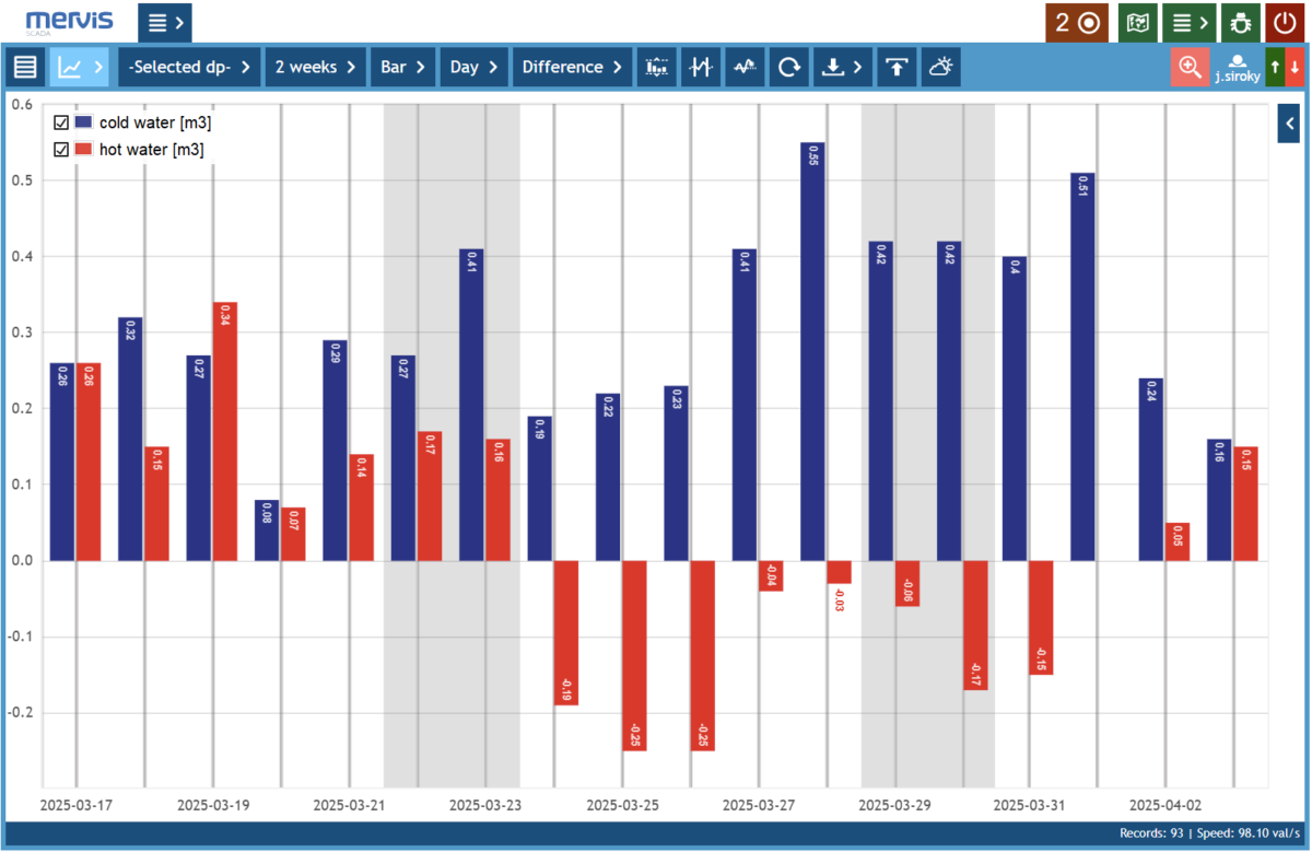
In the anonymized chart below, something didn’t quite add up — literally. At first glance, we see a standard consumption profile. But then, suddenly, the hot water flow drops into negative values. Suspicious already — but when you look closer, the negative hot water flow has the exact same amplitude as the cold water consumption. Coincidence? Unlikely.
Hot and cold water consumption.
As it turns out, this wasn’t a bug, but a shady workaround: by blending some hot into the cold line, someone was quietly lowering their hot water bill. After all, hot water tends to cost more — and if the cold water meter doesn’t mind going a bit into the negatives, why not?
Apparently, the data didn’t. The takeaway? Always check your inputs — not just for errors, but for creative interpretations of how things should work. Sometimes, the data doesn’t just show inefficiencies — it reveals cheeky tricks hiding in plain sight.
And in this case? The little discovery led to a practical outcome: plans to install check valves (non-return) so that future “reverse savings” won’t be an option.