Every journey into AI begins with a crucial first step: understanding your data. Many clients approach us eager to jump straight into machine learning (ML), but without a clear grasp of their data or meeting key prerequisites for ML, this leap often leads to frustration. Why? ML can only produce meaningful results when built on a solid foundation—with data preprocessing playing a vital role.
This is where data visualization comes in. Seeing your data clearly and gaining new perspectives and insights is the essential first step. Some methods, like heatmaps, go even further—empowering technical teams with detailed analysis while providing non-technical stakeholders with an intuitive, quick and easy-to-understand view of optimization opportunities.
Heatmaps
For those unfamiliar with heatmaps, they are visual representations of data where values are displayed as colors. This makes it easy to spot patterns, trends, and anomalies at a glance, providing an intuitive way to understand complex information. Let’s explore some examples!
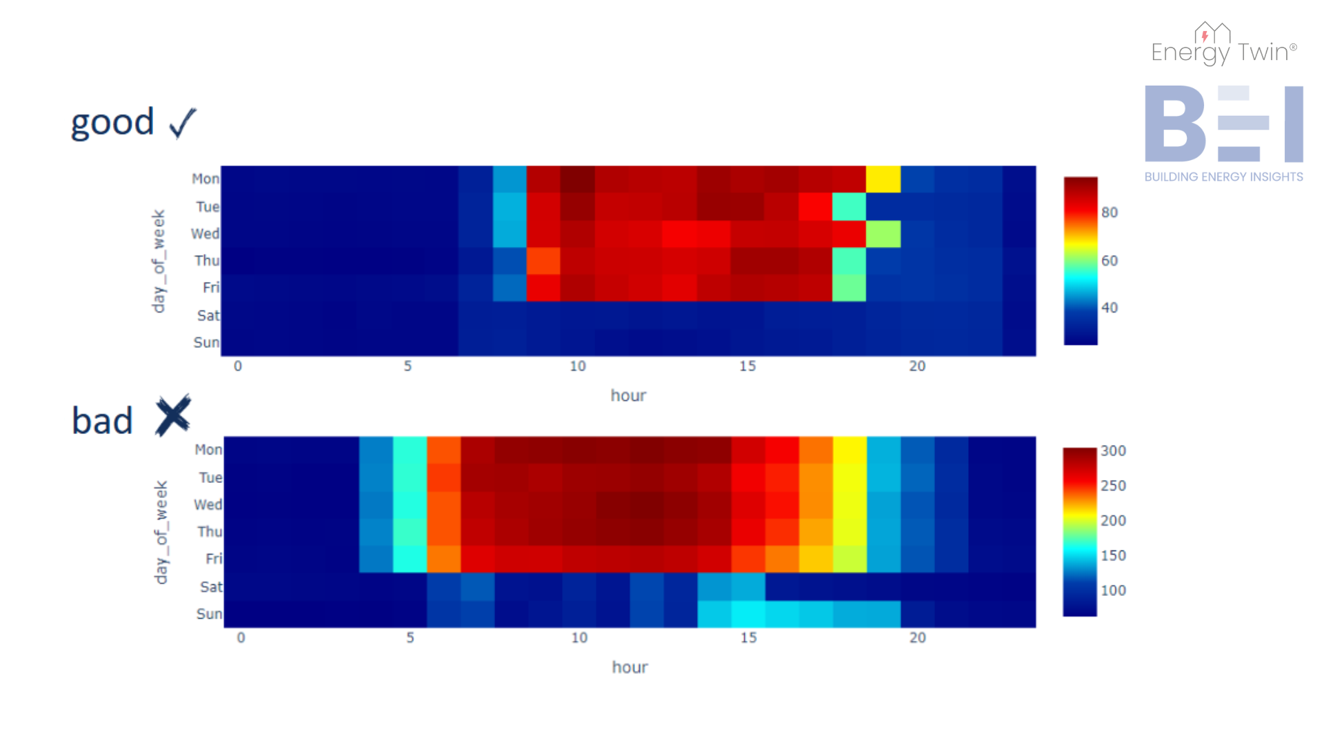
In the following set of heatmaps, the x-axis represents the hour of the day, and the y-axis displays the days of the week. Each cell within the heatmap reflects the average energy consumption for a specific hour and day, providing a concise visual summary of the building’s energy use. This approach is comparable to a pivot table with conditional formatting, where data is organized systematically and shaded to highlight key patterns and anomalies.
The first heatmap showcases an office building with a well-configured weekend setback. The heatmap clearly shows low energy consumption during night hours and weekends, which are shaded in blue. This indicates that the building’s energy use is well-managed during non-operating hours, with peak energy usage occurring during standard working hours, from 9 a.m. to 5 p.m. on weekdays, with slight extensions to 6 p.m. on Mondays and Wednesdays.
In contrast, the second heatmap highlights an office building with operational inefficiencies. Starting with the weekend setback, we see that Saturday is well-managed, but Sunday shows an anomaly. From 2 p.m. to 7 p.m., energy consumption unexpectedly rises, disrupting the consistent blue pattern of low energy use throughout the day. Additionally, there’s a problem with the startup and shutdown periods. If the building operates from 7 a.m. to 5 p.m., why is it starting up as early as 4 or 5 a.m.? The night setback, which is set to begin at 8 p.m., is also somewhat late. It would be more efficient if the setback were activated earlier, around 6 or 7 p.m., to minimize unnecessary energy consumption.
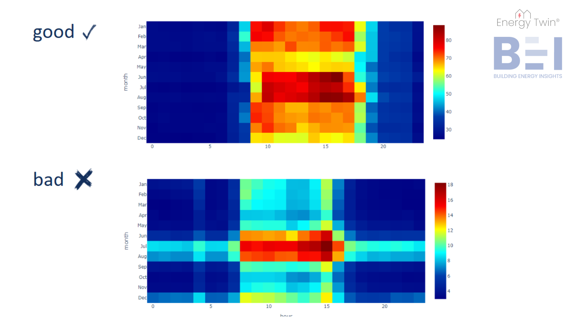
To gain a deeper understanding of your building’s energy usage patterns, it’s crucial to look beyond daily patterns and consider how energy usage changes throughout the year. In this set of heatmaps, the y-axis represents the months of the year, giving us a clear view of how energy consumption fluctuates across the seasons.
In the first heatmap, we observe consistent and effective night setbacks year-round. We also see that the building is cooling-dominated, as the highest energy consumption occurs during the summer months of June, July, and August. Some heating-related energy use is apparent in the mornings during January and February. These patterns are typical for an office building in Central Europe, where gas heating is common, and cooling accounts for the majority of electrical energy consumption in warmer months.
In contrast, the second heatmap illustrates inefficient cooling practices. During the summer months, particularly in July and August, night setbacks show higher energy consumption than expected, indicating inefficiency. Additionally, we notice regular energy usage at 4 a.m. in certain months, including June, July, August, and December, which suggests unnecessary operational activity during off-hours.
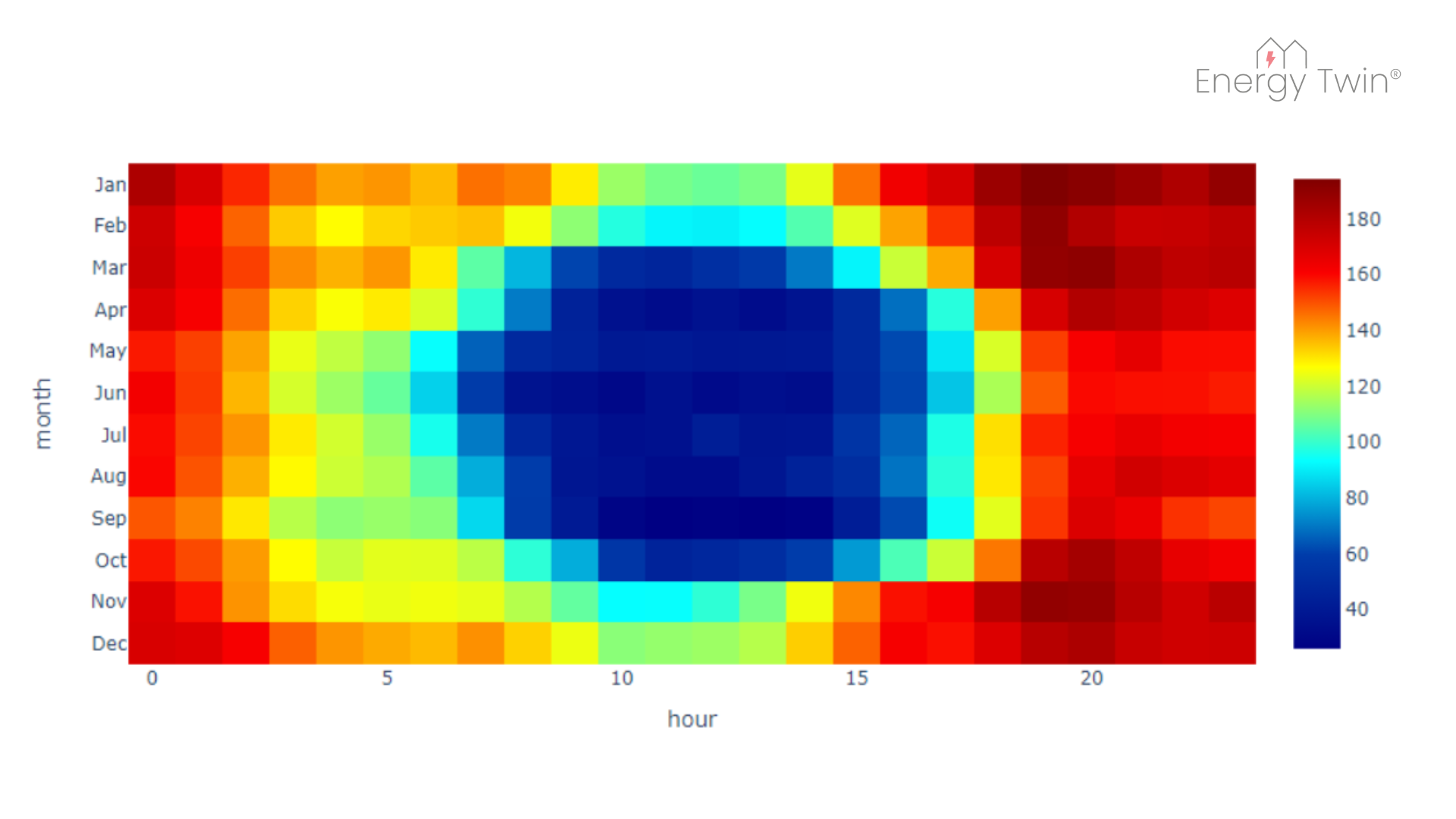
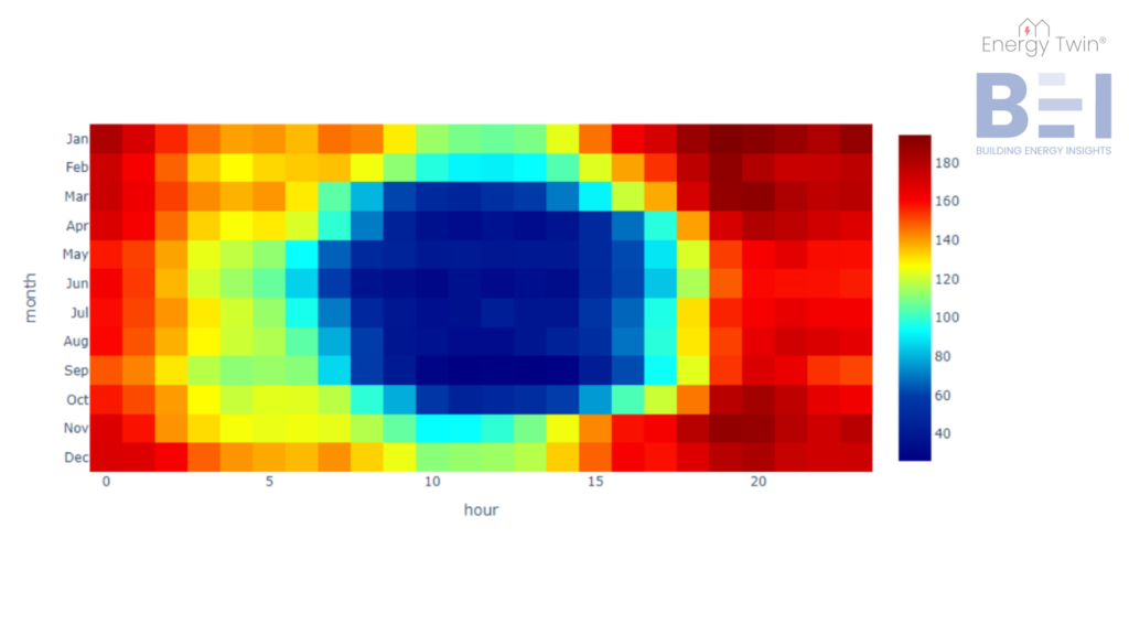
A unique energy pattern is shown in the following heatmap from a building located in Central Europe. The lowest energy consumption occurs during the summer and daylight hours. What’s responsible for this change?
The building is equipped with photovoltaic (PV) panels. This example illustrates how renewable energy sources can significantly alter a building’s energy profile, and heatmaps provide an intuitive way to track and understand these shifts.
Conclusion
Heatmaps are a powerful yet simple tool for understanding energy consumption patterns. Whether revealing operational inefficiencies in weekly heatmaps or uncovering seasonal trends in yearly heatmaps, they provide a clear, actionable view of a building’s energy usage. By starting with this foundational step, we ensure that the data is not only understood but also prepared for deeper analysis, such as machine learning. This approach enables smarter decision-making and paves the way for AI-driven insights that can optimize energy management across buildings and portfolios.
